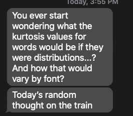
You ever have a random text that sent your brain to work? Here’s mine today:
KD Text
Followed up with examples that lol is bimodal, while loop is positively skewed, and enter is “almost normal”. The lovely K.D. posed this question to me earlier, and I already have procrastinated a lot today, so here’s to more! First, I typed out some fonts in Word to help me figure out how to code the two important parts for this question: width and height. Webdings specifically by request. We have one serif font, one sans serif font, and one monospaced font.

Font Picture
I don’t have a perfect representation of this numerically, but for this analysis, we are going to compare everything to the letter a. Therefore, a is coded as a 1 for width and a 1 for height. For skinnier letters, like f, i, j, and l, they get a .5 for width. The letters m and w received 1.5 for serif and sans serif fonts for being wider than the rest. A mono spaced font like console received all 1s for width. Very strangely, the only skinny letter in Webdings is the letter m for the little man character. For height purposes, all readable fonts are the same, tall letters got a 2 for being tall. They don’t quite actually take up 2 height wise, but for the math here, 2 is a bit easier to work with.
font_size <- read.csv("font_sizes.csv", stringsAsFactors = F)
head(font_size)
## letter sans_serif mono webdings height
## 1 a 1.0 1 1 1
## 2 b 1.0 1 1 2
## 3 c 1.0 1 1 1
## 4 d 1.0 1 1 2
## 5 e 1.0 1 1 1
## 6 f 0.5 1 1 2Let’s take the word enter for a second in a sans or serif font (they were the same honestly wide and tall wise). To create a distribution for enter, we are going to do the following:
- e = 1 for the first letter * 1 for width = 1 repeated 1 for height
- n = 1 for e + 1 for width = 2 repeated 1 for height
- t = 1 for e + 1 for n + .5 for width = 2.5 repeated 2 for height
- e = 1 for e + 1 for n + .5 for t + 1 for width = 3.5 repeated 1 for height
- r = 1 for e + 1 for n + .5 for t + 1 for e + .5 for width = 4 repeated 1 for height
enter <- c(1, 2, 2.5, 2.5, 3.5, 4)
hist(enter, breaks = 5)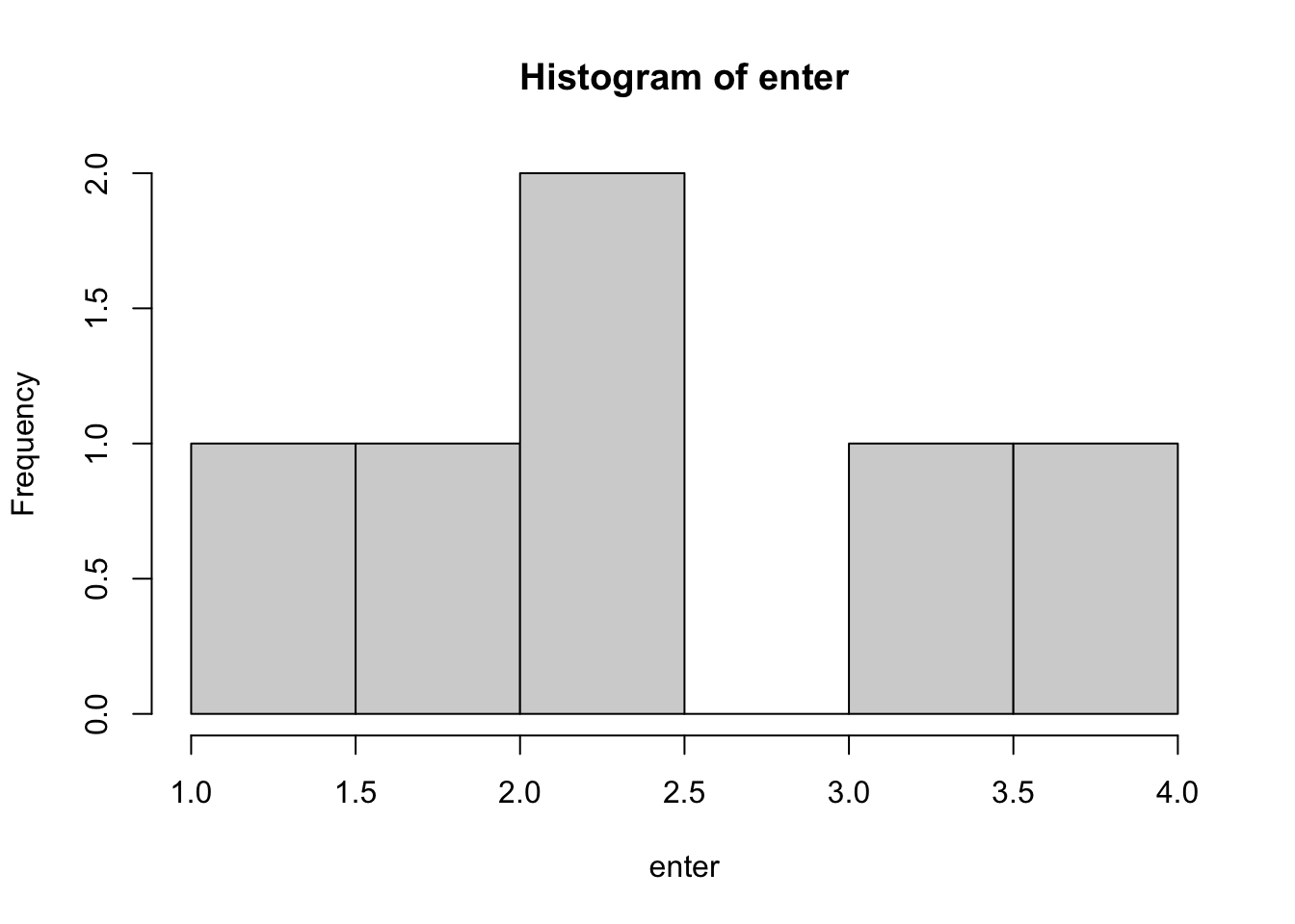
Again, not a perfect representation, but should do. Then we can calculate skew and kurtosis on the word:
library(moments)
skewness(enter)
## [1] -0.099779kurtosis(enter)## [1] 2.050242So, almost no skew, and some kurtosis, but cut the word some slack with such a small sample size ;). In the Webdings font, this word would be perfectly uniform, as each character takes up the same height and space, since there’s no letter m.
enter2 <- c(1,2,3,4,5)
skewness(enter2)
## [1] 0kurtosis(enter2)## [1] 1.7We will apply this algorithm to the English Lexicon Project with some caveats to only pick words with at least three letters, who are mostly real parts of speech, excluding some NULL values in the ELP data.
elp <- read.csv("elp_small.csv")
elp$word <- gsub("'", "", elp$word) #remove '
elp <- elp[!duplicated(elp$word) , ] #remove duplicates
elp$word <- tolower(elp$word) #lower case
elp$length <- nchar(elp$word) #recalculate length without '

elp <- subset(elp,
              pos != "NULL" & length >= 3)

nrow(elp)
## [1] 71607Now, we can create a function to calculate the skew and kurtosis for each word:
- First, create an empty dataframe to save the data in.
- Next, we are going to loop over all the words (this is slow, but whatever).
- For each word:
- Break apart the letters.
mapvaluesto convert the letters into numbers based on my scoring system.- Make those numbers with
as.numeric. - Make those cumulative sequences by using the unfortunately named
cumsum. - All the information about height by using
repto create the “tall” letters in the right places. - Calculate skew and kurtosis and save the output.
library(plyr)

final_stuff <- matrix(NA, nrow = length(elp$word), ncol = 7)
colnames(final_stuff) <- c("word", "s_sans", "s_mono", "s_webdings",
                           "k_sans", "k_mono", "k_webdings")
final_stuff <- as.data.frame(final_stuff)

for (i in 1:length(elp$word)){

  letters <- unlist(strsplit(elp$word[i], ""))

  numbers_sans <- cumsum(as.numeric(suppressMessages(mapvalues(letters, font_size$letter, font_size$sans_serif))))
  numbers_mono <- cumsum(as.numeric(suppressMessages(mapvalues(letters, font_size$letter, font_size$mono))))
  numbers_webdings <- cumsum(as.numeric(suppressMessages(mapvalues(letters, font_size$letter, font_size$webdings))))

  repeating <- as.numeric(mapvalues(letters, font_size$letter, font_size$height))

  #height
  distribution_sans <- rep(numbers_sans, repeating)
  distribution_mono <- rep(numbers_mono, repeating)

  #all same height, so nothing to double
  distribution_webdings <- numbers_webdings

  final_stuff$word[i] <- elp$word[i]
  final_stuff$s_sans[i] <- skewness(distribution_sans)
  final_stuff$s_mono[i] <- skewness(distribution_mono)
  final_stuff$s_webdings[i] <- skewness(distribution_webdings)
  final_stuff$k_sans[i] <- kurtosis(distribution_sans)
  final_stuff$k_mono[i] <- kurtosis(distribution_mono)
  final_stuff$k_webdings[i] <- kurtosis(distribution_webdings)

}

write.csv(final_stuff, "final_distribution.csv", row.names = F)
Let’s see what happened! You should take all these results with a small grain of salt, given that the average length of words is 8.33. To better interpret the kurtosis plots, you should know that uniform distributions are ~ 1.76 kurtosis, while normal distributions have a kurtosis of around 3.
kurtosis(c(1,2,4,5,6,7,8))## [1] 1.762602kurtosis(c(1,2,3,3,3,3,3,4,5))## [1] 3.06Serif and Sans Serif Fonts
##skew
mean(final_stuff$s_sans)
## [1] -0.0005320944hist(final_stuff$s_sans)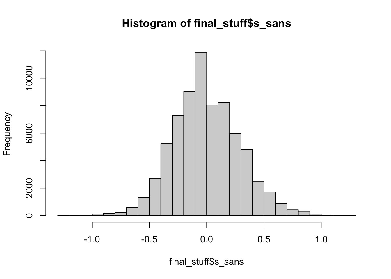
#kurtosis
mean(final_stuff$k_sans)
## [1] 1.913hist(final_stuff$k_sans)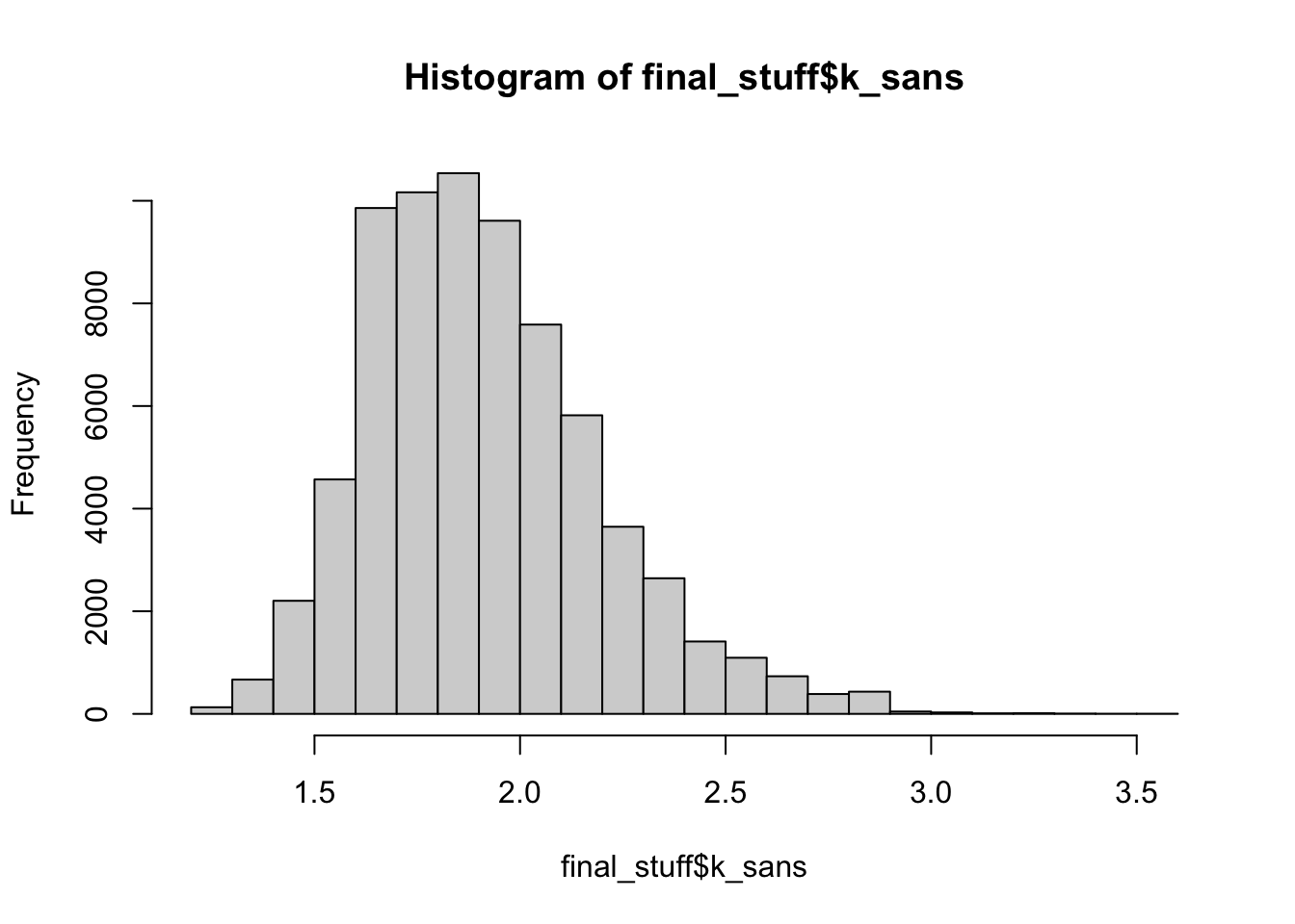
Most serif and sans serif fonts are not skewed, implying that tall letters are a bit more likely in the middle (or none at all). We find that most sans or serif fonts are uniform in distribution. I think it would be hard for them to be much different than that because the highest point is 2 frequency wise.
Monospaced fonts
##skew
mean(final_stuff$s_mono)
## [1] -0.01798692hist(final_stuff$s_mono)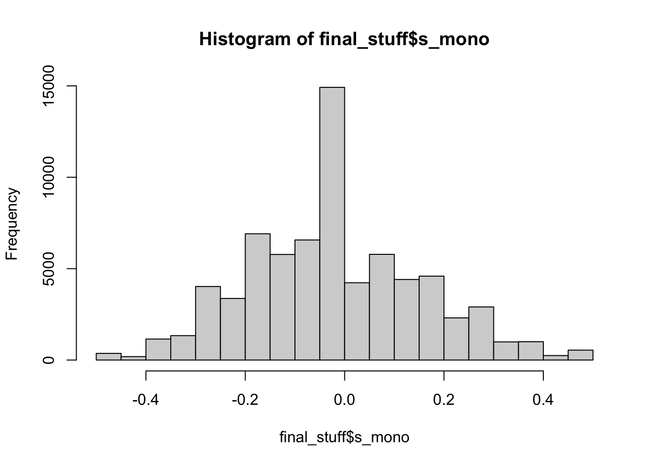
#kurtosis
mean(final_stuff$k_mono)
## [1] 1.821502hist(final_stuff$k_mono)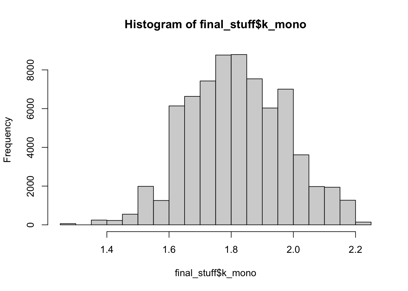
Monospace fonts are nearly all non-skewed (because all the letters take up the same space), and we’ve seen above that tall letters are likely not driving skew by only being on the ends of words. Albeit, “more” skew than the sans/serif fonts, so the variable spacing is doing something. Monospace fonts are also slightly more uniform in kurtosis.
Webdings
##skew
mean(final_stuff$s_webdings)
## [1] 0.004592325hist(final_stuff$s_webdings)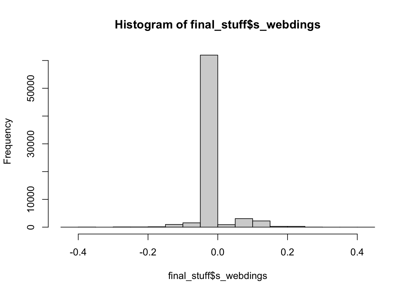
##kurtosis
mean(final_stuff$k_webdings)
## [1] 1.754978hist(final_stuff$k_webdings)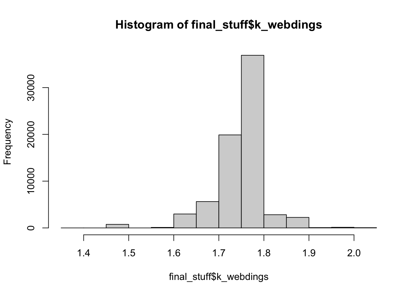
Webdings just makes me laugh, as there’s only the letter m to drive any type of effect, so we see nearly no skew and a very uniform distribution for kurtosis. Again, some small differences from the sans/serif fonts, which is likely due to the even spacing of the letters minus m.
Overall
Some of the lowest kurtosis values are for mimi and what would be bimodal words: brat, drat, fret, trot while the highest values are for words that would be the most normal, especially words with double ll: billow, william, pillow.
The highest and lowest skew values are for words that start and end with tall letters (and nothing in between): firm, dim, emil, emit, omit, and m/w seem to make more of an appearance due to their size differences in sans/serif and Webdings fonts.
So, English is uniform and mostly not skewed. You can find all the data on GitHub.